Postcards For Peace Embroidery Competition
To keep myself busy over the first hurdle of summer, besides the odd job here and there I also decided to enter an embroidery competition via my local library. Since my usual style of embroidery is somewhat ermm... Postmodernist and I haven't had a lot of time for personal projects lately I thought it would be a lot of fun to create something a little more traditional. The competition, called 'Postcards For Peace', entailed designing an embroidered silk postcard in the style of those made during the First World War (such as these) for the Centenary which falls this year. I'd never come across these postcards before but the colours, designs and textures in them, not to mention what an important memento they are in terms of textiles within history were so inspiring that I couldn't wait to start.


If you want to know more about the whatnots of the competition you can click here
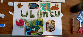
This was my entry:
I used real silk for the backing fabric to keep the authentic touch, French knots with glass beads leftover from another project for the poppy seeds and hand stitched the whole thing. For each colour of the rainbow I used a different stitch:
Red - cable stitch
Orange - stem stitch
Yellow - running stitch
Green - split stitch
Blue - chain stitch
Violet - couching
Pinky - back stitch
although I feel that perhaps because this element is so small the stitches get a little lost. But I know they're there, and now you do too.
The rest of it was back stitch (the lettering at the bottom) and satin stitch, plus a kind of satin stitch / long and short stitch hybrid for the poppy petals. This was a great exercise for me to practise my stitch techniques and I treated it almost as a sampler in order to showcase my skills. I previously didn't think I was any good at satin stitch so I am really happy with how it turned out.
The design itself was heavily influenced by the peace side of things rather than the war; not being a big war person (who is?) and believing that it is good for huh, absolutely nothing, I researched different symbols of peace and used the white poppy and rainbow. Not only is the rainbow for peace, it also represents all the fabulous PRIDE we have here in Bournemouth!!! The yellow, white and blue banners and the phrase 'To Commemorate Peace' came from the Bournemouth Peace Medal which was part of the Peace Thanksgiving Service in July 1919. Although part of the competition brief was to modernise the concept, I seem to have stuck to a more traditional look; but I'm really proud of my work for this and can't wait to see it hanging in the exhibition which all the postcards will go into at Bournemouth Library.
That's enough blabbing, have some details:
I leave you with this


Comments
Post a Comment